Tate Modern:
Bruce Nauman
On 17th November 2017, I was, like a moth, instantly attracted to the bright lights of the Bruce Nauman exhibition (Tate Modern). His work demanded the viewer to (literally) take a step back and consider the purpose and context of his work. Nauman's extensive and imaginative use of media transmits a multitude of different ideas simultaneously. It is clear that his previous studies in Mathematics and Physics informed his practice and are a domineering influence on his work. One piece which caught my attention was 'Violins, Violence, Silence' (1981).
Violins, Violence, Silence
1981
Bruce Nauman
The artwork itself was made of coloured neon tubing with a clear glass suspension frame. As the letters overlap, it is hard to initially distinguish what the piece is actually conveying, proving rather disorientating. Additionally, the buzzing noise which accompanies the piece (originating from the neon tubing) is somewhat distracting. However, it is ironic that while reading 'violins' evokes a pure and unpolluted noise, in reality you are faced with a low, droning buzz. I enjoy the irony of Nauman's work and the complex ideas which lie behind the lights. There is much more to this piece than is initially apparent and I hope that other visitors to the gallery take the time to consider its complexity.
Another piece in the exhibition which caught my attention was 'Raw Material Washing Hands'(1996). The video, which documents one individual washing their hands constantly for 55 minutes is difficult viewing. It is reminiscent of a person suffering from obsessive–compulsive disorder (OCD) in which the individual is performing a routine repeatedly, as though it were a ritual. The video becomes painful to watch as we see the individuals skin being overworked by the soap and water and I must admit that although the video runs for just under an hour, I watched it for no longer than 10 minutes.
Raw Material Washing Hands,
Bruce Nauman
1996
After seeing Nauman's work, it is clear that he questions and stretches the boundaries of what it is to make art. He has purposefully left behind traditional notions of 'fine art' and has distanced himself from paint as a medium.


Chelsea College of Arts
Summer Show 2018


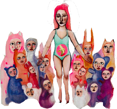
Fig. 1
Fig. 2
Fig. 3

Fig. 4
Fig. 5
Fig. 6
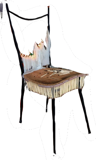
Fig. 7
Fig. 8


Having only just taken down Wimbledon College of Arts own show at Lewisham Arthouse, on the 18th June I travelled to Chelsea College of Arts for their Summer Degree Show. The exhibition proved interesting, and I came away from it much the wiser with regard to how a show should, and indeed, should not, look. Although the quality of work was impressive, the layout of the exhibitions fell short of the mark in my opinion, as it was a somewhat sporadic arrangement which caused me a certain confusion. I also found it difficult to find information about the work presented and, therefore, much of the content below is my reaction and interpretation, without recourse to being informed.
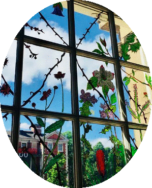
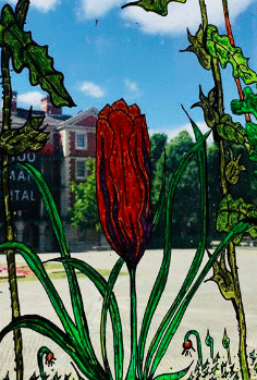
It became difficult to identify which pieces of art belonged to the exhibition and those whose sole purpose was decorative or functional. I experienced this confusion a number of times – for example, when I was walking down a flight of stairs and came across an intricately decorated window. Roses and tulips, alongside an array of other flowers, had been painted on to the glass (Figs. 1 & 2), winding around the sill and window panes. At an initial glance, I thought the piece was decorative, especially as there was no name-tag or title in sight. However, afterwards, on exploring the show online, I found that it was, in fact, the work of an MA student.
I went in search of inspiration and knowledge of course, but was particularly drawn to works which I deemed could be connected in some way with my own art. The first theme that comes to mind, and most obvious for me, was memento mori. Although distancing themselves from the traditional notion of painting, the installations I saw focused around items which are commonplace in classic memento mori works. One such installation comprised of twenty-four vases filled with wilting and decaying flowers (Fig. 3), and, the second, a series of chairs and tables covered in burning candles (Fig. 4). Although there was not a skull, glass, clock, or decaying piece of fruit in sight, the ephemerality was obvious.
A second theme that attracted my attention was work looking at the moral degradation in society. A subject long adopted by students of the arts, there was no shortage of paintings, drawings and sculptures which suggested that humanity is in a state of moral decay. One work by Irina Starkova (Fig. 5) questioned human agency and free will in a post digital age. Starkova’s work suggests that we are a mere product of our own social climate and the prejudices that we carry are entwined in the fabric of our existence. Starkova’s work further suggests that this inhibits us from making our own decisions and forming an original opinion. A similarly depressing notion is put forward by one unidentified artist in the show whose exhibition entitled, Les Yeux Sont le Miroir de l’ame (the piece consists of a series of contact lenses in varying stages of dryness and decay) brings into question the false images that individuals in society hide behind in order to conceal their inner immorality (Fig. 6).
Other work which I found interesting included Mia Williamson’s, Ave Maria Sunday Delight (Fig. 7). One of her paintings contained characters which were animal-human hybrids. It led me to consider the ambiguity of personhood which exists around such hybrids and how this has been a phenomenon which draws back to the Medieval Period. I, myself, have, through painting and research, explored this same notion, looking at how Medieval artists and craftsmen created hybrids in order to dehumanize the ethnically diverse. Williamson’s work encourages discussion and invites one to consider the attributes necessary for personhood to be allocated.
Another piece which caught my eye was Pui Pui Debbie’s composition (a detail of which is found in Fig. 8). A student on Chelsea’s Graduate Diploma in Fine Art course, one is left wondering if Debbie’s previous degree was in English, as this would perhaps lead her to consider the use of words in society and how the meaning of many words is being reshaped. The use of the hashtag also asks the viewer to consider the role the internet plays in circulating and legitimizing new words and phrases.
Ultimately, the Chelsea degree show offered a wonderful opportunity to see some very interesting and engaging pieces of work. It also provided an insight into how one might wish to install an art show, from the lighting of the room to the effective utilization of space. This knowledge is something I will take with me for my upcoming degree show this coming September.